Editing Content ID: EBT-CEPC-EDIT
This lesson walks you through editing content for the various field types found within Marketpath CMS.
Required Fields and Error Messages
Before we describe each field type it’s important to recognize an error when it arises. Some errors only appear when you try to save an object and others appear when you move the cursor or focus in another field.
At the top of the dialog you’ll see a general error message appear when you try to Save (Fig. 1). This is simply telling you that one of the fields on your form or in your dialog has an error.
![]()
Fig. 1 - General form error
As you scroll down to find the field with the error you’ll see a red triangle with an exclamation point. When you move your mouse over the triangle you’ll see a short explanation of the error (Fig. 2). These error icons will always appear after the field label.
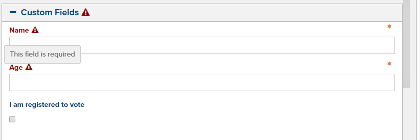
Fig. 2 - Error message for a field
Simple Fields
Following is a list of simple field types. These are basic form fields that you may already be accustomed to using in other web-based applications.
Text Field
A text field is for adding regular text (Fig. 3).

Fig. 3 - Text field
Some text fields may have validators that check for a certain value or format. For example, a text field can require a real number or that it follows a specific format. An error message will appear next to the field label if validation fails.
Checkbox Field
Checkbox fields are for selecting or deselecting a value (Fig. 4).

Fig. 4 - A checkbox field
Checkbox List Field
A checkbox list field allows you to select one or more values in a list (Fig. 5).
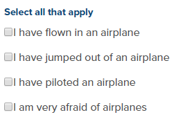
Fig. 5 - A checkbox list field
Datetime Field
A Datetime field allows you to select a date, set a time, and select a timezone (Fig. 6).
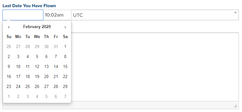
Fig. 6 - A datetime field
HTML Field
An HTML Editor field, also known as a WYSIWYG field, allows you to edit content with rich text, images, links, and more (Fig. 7). WYSIWYG stands for What You See Is What You Get. To learn more about this field, please refer to the HTML Editor course module.
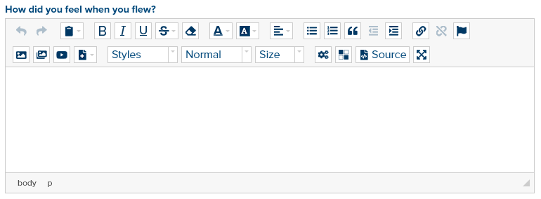
Fig. 7 - An HTML field
Radio Field
A radio field is a list of items that allows you to select only one (Fig. 8).
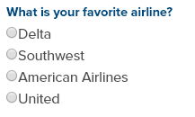
Fig. 8 - A radio field
Select Field
A select field allows you to select one or more items from a drop-down list of items (Fig. 9). Most select lists only allow one selection but some may allow multiple selections. To select more than one item in the drop down list, hold down the CTRL button while you select each.

Fig. 9 - A select field
Textarea Field
A textarea field allows you to enter regular, unformatted text with multiple lines (Fig. 10).

Fig. 10 - A textarea field
Toggle Field
A toggle field allows you to choose one of two states (Fig. 11). Clicking the toggle button switches to the other state. State values can be any two values the developer setup but are often On/Off or Yes/No.

Fig. 11 - A toggle field
URL Field
A URL field allows you to insert a website URL, link to a Marketpath CMS Page, Image, or Document, create an Email or Telephone link, or execute Javascript when clicked (Fig. 12).

Fig. 12 - A URL field
Single Object Select Fields
In Marketpath CMS, you will run across fields that allow you to select one of a certain type of object. For example, most objects allow you to select a Folder to help organize the item. When nothing has been selected, the Select button will appear orange (Fig. 13). To select a folder, you simply click on the orange Select button or anywhere in the area to the right of the button.

Fig. 13 - Select a folder
Once a selection has been made, the button will appear gray and the name of the selected folder will appear to the right of the button (Fig. 14). You can remove this selection by clicking the X icon or by clicking the Select button and making a new selection.

Fig. 14 - Select a folder with a value
When you click the Select button you will see the Folder Select dialog. Click the left-facing arrow to select the appropriate folder (Fig. 15). You can also add a new folder at this time by clicking the New button.
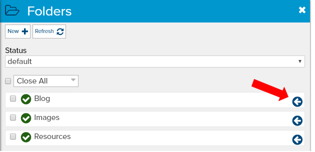
Fig. 15 - Single folder select dialog
Other single select fields will show the standard list view dialog but in selection mode. You can either click on the left-facing arrow for the item you want selected or click on the item name itself. The image select dialog will show image thumbnails to make finding the proper image easier (Fig. 16).
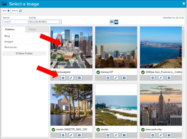
Fig. 16 - Single image select dialog
Most other single select dialogs will just show the name and the left-facing arrow (Fig. 17).
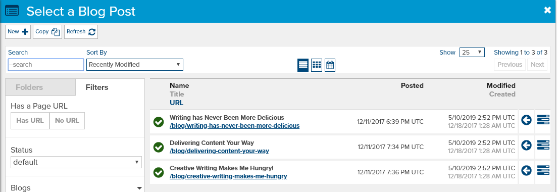
Fig. 17 - Blog Post single select dialog
Multiple Object Select Fields
Marketpath CMS allows you to select multiple objects at one time. These field types are also called List Fields. For example, most objects allow you to associate one or more Authors and Tags. To select multiple tags, click the long add Tags button (Fig. 18).

Fig. 18 - Select tags field
When the Select a Tag dialog opens, you can select one Tag by clicking the name or the left-facing arrow. Or you can click the checkbox next to each Tag you want added and then click the Select button at the top (Fig. 19). Here’s a helpful hint - the Tags will be added to the Tag list in the order you select them.
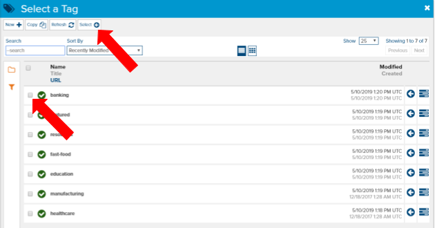
Fig. 19 - Select one or more tags
All the other multiple select field types and dialogs will function the same way.
Once you have made your selection you will see the Tags added to the Tag field. In this view, you can sort them by clicking and holding the vertical arrows and then dragging and dropping to a new location in the list (Fig. 20). You can also click the X button to remove the item from the list or click the properties icon to make changes to the item.

Fig. 20 - A Tag list with values. Arrows point to sorting (left) and removing from the list (right)
Feedback?
Please fill out the form below with your feedback or any questions you may have after working through the "Editing Content" lesson.