
Lots of updates to the UI, including an interactive preview site! You can now click on content areas in the preview pane of the page editor in order to edit the content in the edit pane, and editing the content in the edit pane automatically updates the preview area.
Video Overview
Length: 6:35
UI Refresh
We made a number of "small" changes to the UI which we believe make it easier to use. The end result is somewhat dramatic:
| Before | After |
 The page editor used to show the site name and the page Browser Title, with a relatively un-styled Logout link and no preview shortcuts |  The page editor now shows the page URL, with a styled Logout link and shortcuts to hide the preview area entirely, to show the preview area at either mobile or tablet breakpoints, or to open the preview in a new tab with the full browser width. |
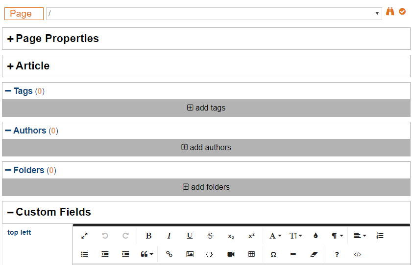 All of our forms received a makeover in this release, but nowhere is it more noticeable than in the page editor. The new styles give more horizontal screen space to form fields, while also providing additional contrast to groups headings, making it easier to read overall. |  To start with, we separated content into two "tabs" - Content and Properties. Content includes all of the "entity" fields as well as all of the custom fields. Properties includes all of the page-specific fields as well as the tags, authors, and folders. Lastly, we added shortcuts to expand and collapse all sections. 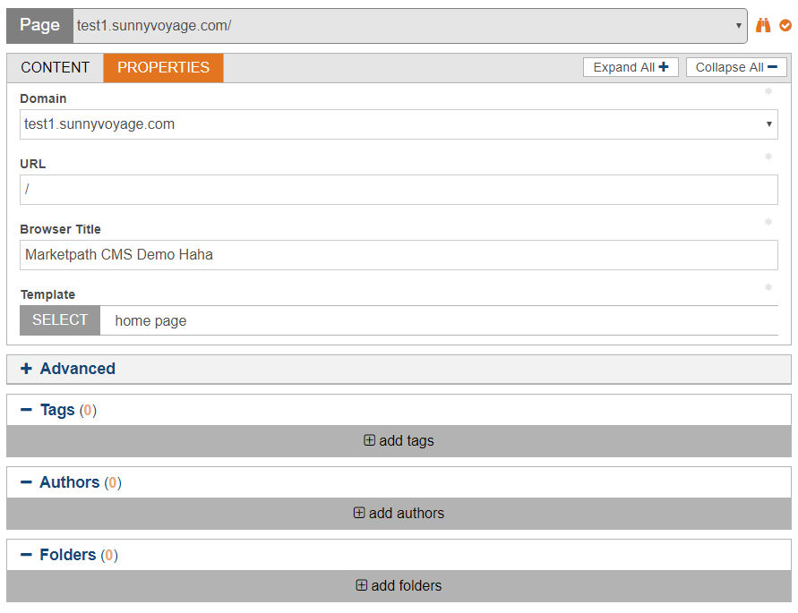 |
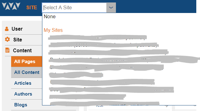 The old site selector was a simply list of all of the sites that a user had permission to manage. It was simple and got the job done well. | 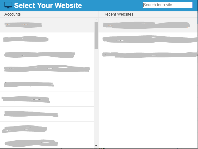 The new site selector took on a whole new redesign, including the addition of the "Recent Websites" shortcut. It is still fully keyboard-friendly, including simultaneously filtering accounts and sites and using the arrow keys + enter/tab to select a site so you only have to use your mouse if you want to. |
 The old management interface included white-space around each dialog, allowing for simpler styles in many cases but losing screen real-estate in the process and also looking a little dated. |  The new design minimizes lost screen real-estate by removing the excess white-space and instead adding a couple extra shades of blue to break up the monotony. |
 All notifications used to be displayed at the bottom of the screen for a few seconds before disappearing. This caused some minor usability issues when important notifications got lost along with unimportant notifications, when the notifications covered up something you were working on, or when there were just too many notifications at once. |  Now when a user initiates certain actions - such as publishing an item or starting an export, we display a notification icon in the top-right corner of the screen. Users can click on the icon to see what is pending and what is completed, or to see details if anything fails. What is ever cooler - if the user switches to another page, their pending actions switch with them! This icon is included in the edit interfaces as well. |
 Certain dialogs - such as the search dialog, the new object dialog, and the accounts dialog - used to be displayed on top of all other dialogs. While this "worked", it felt un-polished to some users and there were also a number of usability issues that it caused. |  All dialogs in the management interface now open up in the same place - right next to the site navigation. Overall this is a simpler setup, but it feels much cleaner and easier to use. |
| And More! | |
Core Liquid Fields
Most core fields now have extra properties available. They can all still be output to the template the same way they were before, but most fields now also come with is_valid and other helpful properties that developers can utilize in order to write cleaner code that does more. Instead of writing {% if article.summary_html != empty and article.summary_html != "" and ... %}, template developers can write {% if article.summary_html.is_valid %} just like they can for custom fields.
This is a bit of a nerdy feature that mostly template developers will be excited for, but it also set us up for our next major feature...
Preview Interaction
We have dramatically increased the level of interaction between the management interface and your preview sites. You can now click on content areas in the preview pane in order to begin editing the content in the edit pane. As you begin typing, watch how the preview pane is automatically updated with your latest content! Don't forget to save, though - this interaction all happens in your browser without actually saving anything unless you hit the "Save" button (or "ctrl-s").
This new feature really makes the CMS feel more like a premium product. All while allowing you to maintain 100% control of the output of your site!
How did we accomplish that? Its simple.... well, OK. It's not really that simple. But to keep things brief, we leverage our control of the environment and some built-in developer shortcuts in order to "sneak" extra functionality into code written by the template developers. They have 100% control of the output, and so do we! It's almost too good to be true.
Other Updates
Even with all of these major updates, we still managed to squeeze a few other minor tasks into this release.
- Feature: Added proper "URL" field type for datastores and custom fields.
- Feature: Added image presets to the {% img %} tag.
- Improvement: Made it easier to multi-select objects while viewing them as icons.
- Improvement: Minor stability improvement for redirects
- Improvement: Minor improvements to domain swap
- Improvement: When creating a new item from a list view, use the current filters as initial input for the new item (eg: if filtering by tag, add the filtered tab to the new item, if filtering by template, add the filtered template to the new page, etc...).
- Improvement: Allow editing of datastore item fields in the page edit interface.
- Improvement: Increased cross-browser compatability when using an unsupported browser. We still do not guarantee usability in unsupported browsers. If the login page warns you that your browser is not supported, you should pay attention!
- And more miscelaneous bugfixes, improvements, and UI updates...
